Since I found out that the Carrefour logo (French supermarket chain) had a hidden “c” (in white), I started seeing a lot of logos with hidden stuff.
Here you have some:
Carrefour
Living in France and having Carrefour supermarket all around Europe, it is only now that I realized that there is a “C” in the white part of the logo. Carrefour is one of the biggest European retailers, and it’s also French for “crossroads”. The logo symbolizes this word via two opposite arrows. They also added the first letter of the name, because if you look closely you’ll see the letter C in the negative space between the two arrows.
Toblerone
You’ve probably seen the Toblerone logo dozens of times – it’s just a mountain, right? Look closer. There’s a bear shape hidden in the negative space within that mountain, symbolizing the city of Bern, Switzerland where the Matterhorn mountain that inspired the logo is located.
Sony Vaio
VAIO was originally just an acronym for Video Audio Integrated Operation – since changed to Visual Audio Intelligence Organizer. But the strange, seemingly abstract logo derives from another lucky coincidence: ‘VA’ represents an analog wave and ‘IO’ represents digital binary code, perfectly illustrating the integration of analog and digital technology.
Presbyterian Church
How many symbols can you fit into one relatively uncluttered, uncomplicated logo? The Presbyterian Church logo is a pretty good example of making this work: you’ve got a cross, a bible on a pulpit, a pastor’s robes, a dove, a fish and fire all within the same basic shape.
Northwest Airlines
Before they changed it to something far less interesting – and then faded into oblivion by merging with Delta – Northwest Airlines had one of those logos that contain a bit of symbolism entirely unnoticed by the vast majority of the public. Sure, it’s got the ‘N’ and ‘W’, seemingly placed inside a circle for no good reason – but check out the location of that little triangle making up the upper corner of the ‘W’. It’s the arrow of a compass, pointing northwest.
Museum of London
Well now, isn’t that a pretty… blob. But there’s more to the Museum of London logo than an artsy splash of watercolor; the various colored circles actually represent the changing shape of London throughout history.
Milwaukee Brewers
Sure, it was just a bit of luck that gave the Milwaukee Brewers baseball team a name with the initials ‘M’ and ‘B’, but it took a great logo designer to see how those letters – combined with the negative space in a lowercase ‘b’ – could form a mitt with a baseball in it.
London Symphony Orchestra
The London Symphony Orchestra escaped its staid reputation a bit with this redesigned logo, featuring the letters ‘LSO’ in a modern script that forms a single wavy line. But what you may not see immediately is the abstract image of a conductor waving with one arm and conducting with the other.
Hope for African Children Initiative
In this trick of the eye, you’re actually drawn to look at the negative space first – the continent of Africa in white, albeit a rather unfaithful rendering. A closer look reveals the shapes of a child and a woman on either side in shades of orange.
Elefont
Designed by Mike Erickson (otherwise known as Logomotive) for a fictitious company, this logo has three different elements combined into one simple and visually striking symbol. That curving lowercase ‘e’, which stands for ‘elefont’ and highlights an elegant font, also has an elephant trunk shape hidden inside it.
Eighty 20
Do you ever see a logo and think to yourself, what was the designer thinking? How does this random image contribute to or identify this brand’s identity? In this case, at least, you’re simply not in on the joke – unless you’re a math nerd. If you view the dark squares as ‘1′ and the light squares as ‘0′, the two rows read 1010000 and 0010100, which read 80 and 20 in binary.
Cluenatic
Perhaps it’s not the most readable logo ever, but it works flawlessly as a visual representation of the puzzle game ‘Cluenatic’, which involves unraveling four clues. Each of the four letters in the world ‘Clue’ are nested inside each other like a puzzle or a maze.
Bison
Designed for a rock band from Vancouver, this logo is like one of those left brain/right brain quiz images: what do you see first, the picture or the word?
Amazon
This logo doesn’t seem to hide much at first sight, but it gives you a little insight in the philosophy behind the brand. First of all, the yellow swoosh looks like a smile: Amazon.com want to have the best customer satisfaction. The swoosh also connects the letters a and z, meaning that this store has everything from a to z.
Baskin Robbins
The old logo of Baskin Robbins had the number 31 with an arc above it. The new logo took this idea to the next level. The pink parts of the BR still form the number 31, a reference to the 31 flavours.
Big Ten
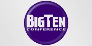
Big Ten is an academic union which was founded in the year 1896. Until 1990, this union consisted of 10 universities, but in June 1990 Pennsylvania State University was added. They didn’t want to change their name, so they added the number 11 to the logo.
Continental
Continental is a manufacturer of tyres. You could actually see this in their logo, because the first two letters create a 3-dimensional tyre.
Eight
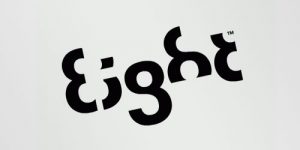
Every letter is made of the number 8.
Fedex
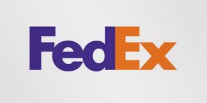
This is probably one of the best known logos with a hidden meaning. If you look closely, you’ll see an arrow that’s formed by the letters E and x. This arrow symbolizes speed and precision, two major selling points of this company.
Formula 1
At first, this logo might not make much sense. But if you look closely, you’ll see the number 1 in the negative space between the F and the red stripes. I also love how this logo communicates a feeling of speed.
GreenLabs
I know this logo looks like a simple, boring green tree, but if you look at the tree crown, you’ll see that it can also be interpreted as a brain. The logo lays emphasis on the strong intellectual capabilities of the company’s staff and also reflects ‘green’ and ‘labs’ parts of their name.
Hartfort Whalers
This logo also uses a negative space to create the letter H. You can see three different parts: the letter H and W and a whale’s tail in blue.
NBC
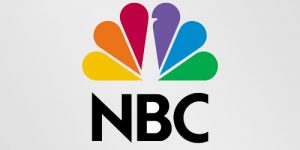
The NBC (National Broadcasting Company) is one of the biggest American television networks. I think most of you have already seen the peacock in this logo. The peacock has 6 different tail feathers, referring to the six divisions at the time that this logo was created. The peacock’s head is flipped to the right to suggest it was looking forward, not back.
Roxy
Roxy is a company that specializes in clothing and accessories for girls who love snowboarding, surfing… The company is actually a part of Quiksilver. The Roxy logo is made of two Quiksilver logos that form a heart.
Sun Microsystems
The Sun logo is one of the most famous ambigrams in the world. You can read the brand name in every direction; both horizontally and vertically. This logo was designed by professor Vaughan Pratt of the Stanford University.
Tostitos
If you look at the centre of this logo, you can see two people enjoying a Tostito chip with a bowl of salsa. This logo conveys an idea of people connecting with each other.
Twins
This logo was made for twins. To reflect the essence of the duo, a bold typeface was created to reflect the boldness of their approaches. The number 2 was integrated to show the creativeness of their ideas.
Unilever
Unilever is one of the biggest producers of food, beverages, cleaning agents and personal care products. They produce a huge amount of different products and they wanted to reflect this in their logo. Each part of the logo has a meaning. For example: the heart represents love, care and health – feeling good, a bird is a symbol of freedom. Relief from daily chores – getting more out of life.
Body Wisdom
In this case, a logo design for a high end day spa,the hands effectively convey massage, while the proximity of the “eyes” within the owl shape created by the hands clearly say “wisdom”.
Amnesty International 30th anniversary
This logo was designed by Pekka Piippo from Finland, for the Amnesty International 30th Anniversary of Finnish Division. Clever multiplication of 5 fingers on 6 hands mark the occasion of 30th Anniversary occasion.
ED logo
The designer of ED – “Elettro Domestici”, “Home Appliances” in English, changed the concept of traditional logo designing through this logo. The designer has amazingly used the negative space to demonstrate the letter “E” and “D”
Fuga
It is a logo for Architecture Center Of Budapest. It might seem something like a maze but if you follow the white space, the four lettered company name will become evident.
!N3K8
It is a business and IT consulting company based in the UK. The logo explains the word “intricate”
Lafayette
Galeries Lafayette (Paris), you will notice that it’s logo represents Paris with its joined letters “t” to form Eiffel Tower.
Marriage
What better logo can be used to symbolize a marriage with two mirrored “R” in the middle. No frills, no shadows, still so powerful and meaningful.
Mosleep
Very cleverly the designer have integrated a bed and the letter “M” in this logo. You cant miss to love it.
Piano Forest
If you notice the logo closely you will observe the trees placement form the keys of a piano. An intelligent way to display two different terms, “piano and forest”, through a single logo concept.
Yoga Australia
At first glance the logo is a simple picture of a young girl doing her yoga but if you watch it carefully the body posture is creating the Australia Map.
8 fish
I am sure, at the first glance you can’t figure out the 8 fish instantly or maybe I am being a little dumb. The designer, very creatively, uses the negative space and monotones to show 8 fish in one logo.
Academy of Fine Arts
The logo shows merger of the lower case letters “A”, “S” and “P”.
B
Although you might think it is a simple “Symbolic Logo” showing a “Bee” but what makes it more appealing is the portraying of the letter “B” and the real “Bee” through a simple symbol.
Minimum
This wavy logo looks like “a queue of letter ‘U’ but I would like you to give a second look. Designed by Kilment Kalchev, the logo spells the word minimum in an unrecognizing manner. I really enjoyed figuring it out
New Man
The reversible Newman logo. This logo is the best example of simple but clever logo.
Treacy Shoes
This logo is the cutest example of hidden logos. The hidden shoe packed between the company initials conveys the company message in a very stylish and interesting way.












4 comments
Pingback: Logos encriptados » Blog - JWT Delvico
Comment by masv
masv July 16, 2010 at 12:21 pm
really good!
Comment by hello
hello October 26, 2010 at 11:36 pm
Very cool. thanks
Comment by Satar Gaeoedoae
Satar Gaeoedoae February 2, 2012 at 4:21 am
I thought LSO’s logo was a pair of music notes, but now I see the conductor.